Quote:
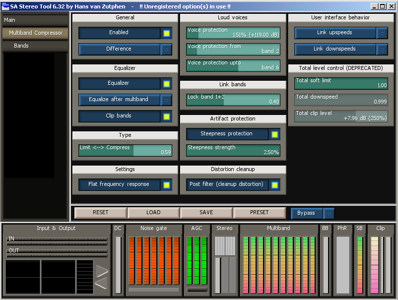
With a slightly smaller font, things could look like this:
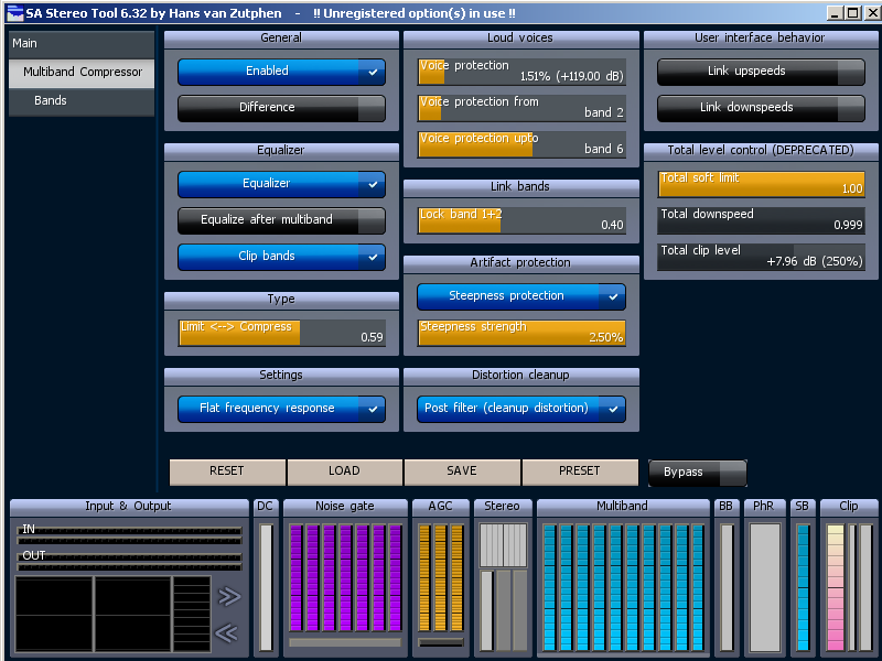
That's getting better, but I still would have to go to "Bands" to do the settings that aren't in that menu node.
I keep hearing the thing about the old one being "confusing" and what not. I just don't understand that. The only thing confusing for me was the actual numeric measurements and what they meant. For example, what in the world is a downspeed of 0.000005? What is being multiplied by 0.000005? Is it actually being divided and not multiplied? Things like that are TECHNICAL, and thus what was really lacking was either a better help section, or tooltips. I did not have any problem at all with understanding the actual visual appearance or knowing where to go to get something done.
I was trying to post screen shots of Creative Labs' software earlier, but the web site tanked with a 502 Bad Gateway. I'm not going to post as many things as I tried to earlier, but I want to mention that I, and probably quite a few other intermediate-to-advanced users would prefer something like the X-Fi Audio Creation Mode:

Yes, that would confuse the living daylights out of other folks, and isn't touchscreen-friendly, but there are those of us who have had audio backgrounds and are familiar with mixers.