All times are UTC+02:00


Post new topic  Reply to topic  [ 752 posts ]  Go to page Previous 131 32 33 34 3576 Next
Author Message
 Post subject: Re: New things...
PostPosted: Thu Oct 18, 2012 3:28 pm 

Joined: Sun May 02, 2010 11:26 pm
Posts: 547
To me best looks and most clear view is left one with colors. I always found old view confusing.
To get it even more clear i think it needs some reordering of sections. For instance Bands is more important than BS412 section. So put it higher.

Also meters should be vertical like in old design.

Then
Band 1 upspeed - Band 2 upspeed
Band 1 downspeed - Band 2 downspeed
Remove remaining peaks - Remove remaining peaks

Can be located under or above this meters and not horizontal like it is now.


Top
   
 Post subject: Re: New things...
PostPosted: Thu Oct 18, 2012 3:59 pm 
Site Admin
User avatar

Joined: Mon Mar 17, 2008 1:40 am
Posts: 11425
I walked around in my building and asked a few people here, so far 2 out of 3 prefer one of the two new interface displays (once the one with colors, once without). I agree with Eldoradofm that things need to be organized differently (current image was made by copying screenshots from the different sections) - most important things must indeed be near the top.


Top
   
 Post subject: Re: New things...
PostPosted: Thu Oct 18, 2012 4:55 pm 
Site Admin
User avatar

Joined: Mon Mar 17, 2008 1:40 am
Posts: 11425
Quote:
For example,
Bass Boost / Phase rotation / - all can be in one window.
Noise Removal - Same all in one splited window for "n-hiss" and "n-gate"
Configuration - CPU/latency, Plug-in, Scheduler, Web Interface - All are general setting and can fit in one window.
Levels - That can be removed and placed in Main (MENU) section.
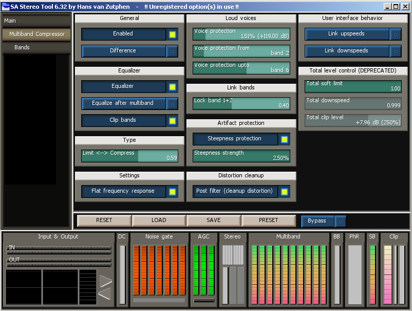
Multiband - All except "Bands" can be in one place.
Rest reorganizing according to new (smaller sizes of Sliders and buttons)
Looking at Levels. Actually Pre Amp was already present in the main section - post am is not but how useful is that?

Configuration: Yes they can be combined but does that help? I mean, if you're going to configure CPU/latency, what's the use of seeing the Scheduler settings? That's why they are currently separated.

Multiband: Agreed. But only if the display is big enough (it won't fit on an 800x600 touch screen interface).

Noise removal: Hm.. Ideally I would put the bands below the other gate settings. But that doesn't fit on a touch screen interface. Alternatively I can put the to the right of the noise gate global settings, but then I would need something to show in the GUI that those things belong together and the FM hiss filter is something else. Actually this is something that will probably occur more often if I fold several screens into one - good question is how to display this properly.

Bass boost / phase rotation: True, only reason why it's not currently is the basic/advanced interface separation. I'll change it for now to make things more accessible without having to click so much.


Top
   
 Post subject: Re: New things...
PostPosted: Thu Oct 18, 2012 5:00 pm 
User avatar

Joined: Tue Mar 17, 2009 2:56 pm
Posts: 4231
Color displey with better reorganization.
But also sliders can be smaller (horizontal)! So, instead 2 columns you can make it with 3 columns. It will take way less space.
If MB can have that shorter sliders, why not other filters can't.


Top
   
 Post subject: Re: New things...
PostPosted: Thu Oct 18, 2012 5:03 pm 
User avatar

Joined: Tue Mar 17, 2009 2:56 pm
Posts: 4231
Quote:
Multiband: Agreed. But only if the display is big enough (it won't fit on an 800x600 touch screen interface).
Well.. if you keep all this huge buttons and sliders it will surely not fit.


Top
   
 Post subject: Re: New things...
PostPosted: Thu Oct 18, 2012 5:13 pm 
Site Admin
User avatar

Joined: Mon Mar 17, 2008 1:40 am
Posts: 11425
Quote:
Quote:
Multiband: Agreed. But only if the display is big enough (it won't fit on an 800x600 touch screen interface).
Well.. if you keep all this huge buttons and sliders it will surely not fit.
Eh - you think they are still huge? Or do you just mean horizontally?

I guess you're right and I can save a lot of space horizontally. Only thing is that texts will be cut off - that may make it more difficult to use (or, more difficult to come up with good and short descriptive texts...)


Top
   
 Post subject: Re: New things...
PostPosted: Thu Oct 18, 2012 5:49 pm 
Site Admin
User avatar

Joined: Mon Mar 17, 2008 1:40 am
Posts: 11425
With a slightly smaller font, things could look like this:

Image


Top
   
 Post subject: Re: New things...
PostPosted: Thu Oct 18, 2012 6:28 pm 
User avatar

Joined: Tue Mar 17, 2009 2:56 pm
Posts: 4231
Ok still looks good. Just bit more shadow for font :)
Btw, if possible some combintion with bold font, main manu, for example.

Here you go, all MB settings in one place :)


Top
   
 Post subject: Re: New things...
PostPosted: Thu Oct 18, 2012 6:59 pm 
User avatar

Joined: Wed Nov 19, 2008 7:44 pm
Posts: 1169
Location: Bulgaria
Damn, i haven`t a GUI ..
What is goin on . I install yesterday Microsoft Silverlight
and think after that it`s not opening . I don`t know.
Hans , do you know what graphic resources or third party resources is using ST ( like Net Framework or something ) ?
I ask because if you know from where it is , i`ll reinstall that recources .
I already reinstall my Graphic card driver , but...
P.S: Reinstalled Audio driver ( was broken ) ... still nothing
:(


Top
   
 Post subject: Re: New things...
PostPosted: Thu Oct 18, 2012 8:58 pm 

Joined: Tue Dec 30, 2008 11:50 pm
Posts: 96
Location: Groningen
I was also used to the old interface, it grew over the years, each version more items added, and I grew with it.
The main point is, like you said, a visual overview where you can chose witch items are important for you, thats learning.
The learning should be easy, so not to much different menu's

I'm happy with the lower panel, for clicking on the items, they open. It could be functioning as a "not advanced" menu, if placed on top of the monitorscreen.
Besides, it is a visual monitor of the behavior of ST, to check if you hear something unexpected.

The now upper menu I don't need most of the time, nor don't I need more fancy colors.
Colored or grey/white; the gray/white one is indeed more quiet. Maybe you can use bold fonts for the different items.

The option I used most in this beta was clicking to change frequencies and soft limit in MB a little bit, it's more easy than mouse scrolling.

All on Win 7 64x

THX


Top
   
Display posts from previous:  Sort by  
Post new topic  Reply to topic  [ 752 posts ]  Go to page Previous 131 32 33 34 3576 Next

All times are UTC+02:00


You cannot post new topics in this forum
You cannot reply to topics in this forum
You cannot edit your posts in this forum
You cannot delete your posts in this forum
You cannot post attachments in this forum

Search for:
Jump to:  
Powered by phpBB® Forum Software © phpBB Limited