Stereo Tool https://forums.stereotool.com/ |
|
New things... https://forums.stereotool.com/viewtopic.php?t=4334 |
Page 30 of 76 |
Author: | phoenix [ Wed Oct 17, 2012 6:53 am ] |
Post subject: | Re: New things... |
Quote: Just asking (both of you): What do you think about the Omnia 9 interface? Those buttons are even bigger.... I'm asking because I want to know if it's a matter of taste (you just don't like big buttons) or there's something specifically wrong with my large buttons.
Quote: You don't know what new ST GUI also need to meet! That is 800x600 and 1024x768 touch displays.
I think you are trying to achieve one size that fits all solution. Not possible unless you design multiple schemes which can be switched to by user depending on the type of system.![]() Think of it - Windows 8 Live Tiles are good on Tablets, phones or other hand-held devices. But a seasoned PC user who is more concerned about productivity without having calloused wrist, would prefer the old Start Menu and conventional font size and icon. I really hate giant icons. They look really ugly on a large monitor. The ST interface looks clean but not as shiny(and well aggregated) as Breakaway products - if at all you are making a comparison with Leif's offerings side by side from UI perspective. |
Author: | DJ-DOGGY [ Wed Oct 17, 2012 9:01 am ] |
Post subject: | Re: New things... |
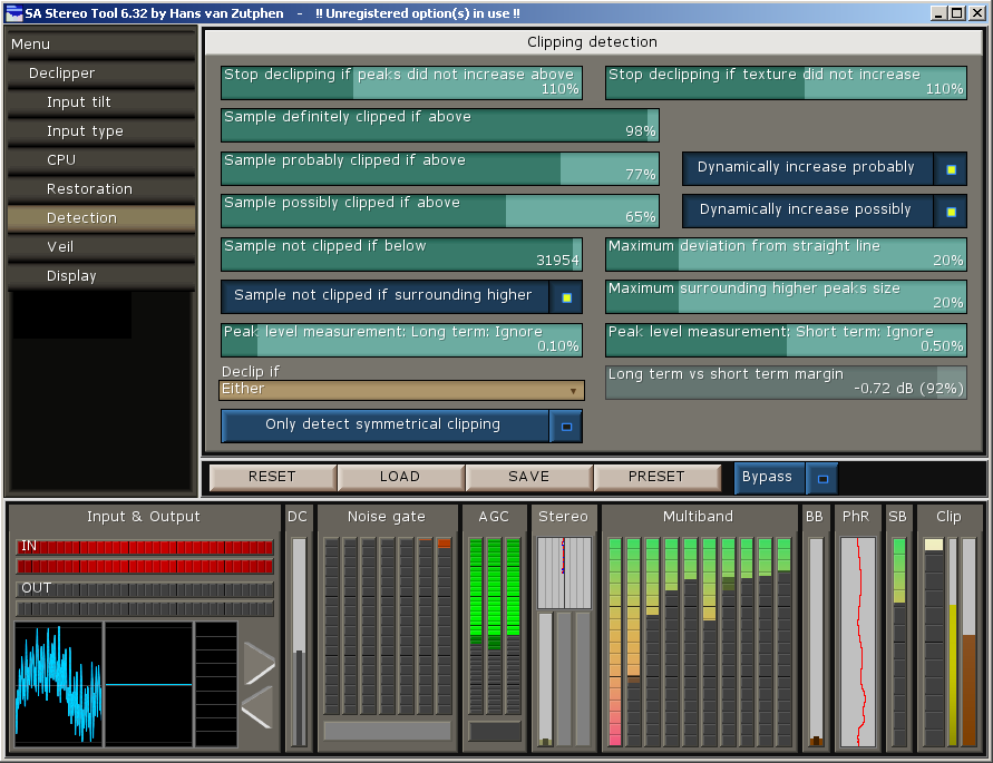
Quote: in progress.. http://i.imgur.com/GjEpr.png (maybe too many colors (?))
Where is the button in that window for "Gating based on volume before pre amp" ????? What is that version without this . Versions that are posted here is not the same ???? |
Author: | DJ-DOGGY [ Wed Oct 17, 2012 1:09 pm ] |
Post subject: | Re: New things... |
Today i try the web interface of ST and when it loads the web, ST crashed. |
Author: | Bojcha [ Wed Oct 17, 2012 1:41 pm ] |
Post subject: | Re: New things... |
Bottons are bit problematic because different sizes. They look like this http://i.imgur.com/akKrl.png http://i.imgur.com/f9A0T.png http://i.imgur.com/lwbQP.png http://i.imgur.com/5egoR.png |
Author: | hvz [ Wed Oct 17, 2012 1:54 pm ] |
Post subject: | Re: New things... |
I'll change it such that a new image is placed on the right side of a checkbox, with the size such that it's always a square. Then I'll set a maximum height zoom value for buttons such that normally (maybe except for the Multiband bands page) the height is always the same - which means that the width of this extra image is also always the same. That should make things a lot easier. This value is already configurable, which means that I could make it bigger for use on a touch screen. I will have to make the renderer a bit smarter though to still be able to put displays in between the sliders and let them get a bigger size if the display is big. |
Author: | DJ-DOGGY [ Wed Oct 17, 2012 2:09 pm ] |
Post subject: | Re: New things... |
In this last buttons .. where will be the text , that we can find for what is the button ? Above , under , inside ? |
Author: | hvz [ Wed Oct 17, 2012 3:25 pm ] |
Post subject: | Re: New things... |
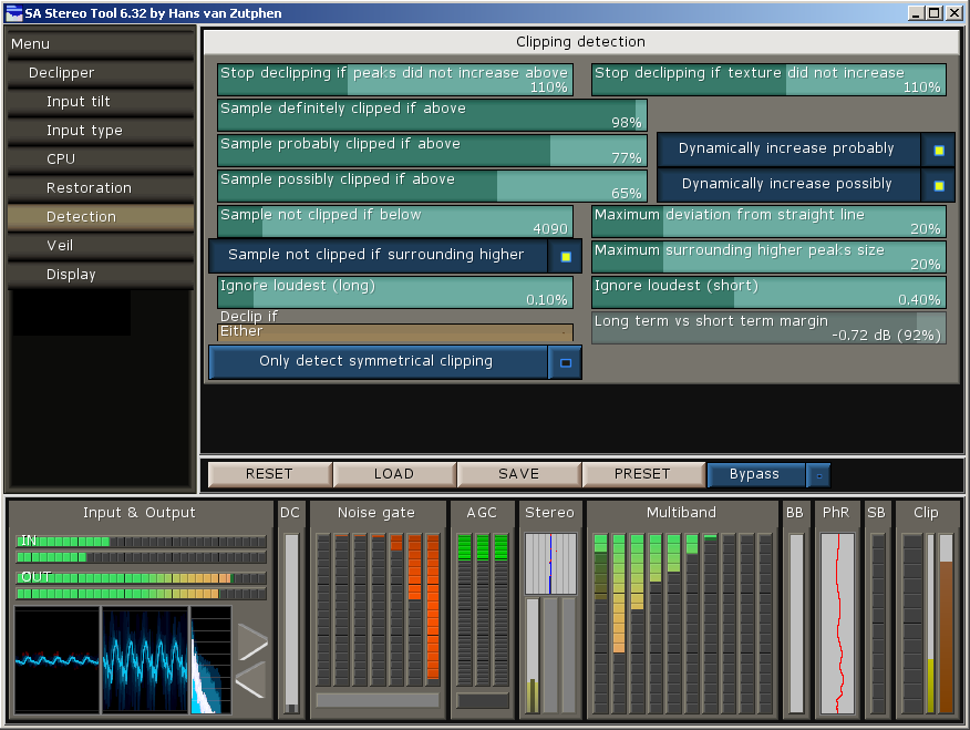
Something like this: ![]() This is NOT Bojcha's skin - I just quickly made something to check if the code works. Also, I think that it's better to put the checkbox on the left. Note: To make things look good, I suppose it would be best if every thing (button, slider, pull-down menu) has exactly the same size and height and space in between. For pull-down menu's I would suggest putting the name of the menu on the left in a different color area, then the current value, then the arrow pointing down. For sliders I think the best solution is to add some filler on the left and right (you need some space where you can click just outside it for precise control). Note #2: Things will probably look a lot better if I place them further apart... |
Author: | DJ-DOGGY [ Wed Oct 17, 2012 4:28 pm ] |
Post subject: | Re: New things... |
I`m not seeing any difference with all text like a button and only in the left or right side to have a light. ( ON/OFF light ) Also no difference with old button and the light in the middle . In all situations text must be in the button . So no diff. And what about the little buttons , where text is definitely not fit in there ? is there any ? I think will have some . Still prefer the current ones ! Finally you`ll have to make it like HTML 5 code , everyone to modify the interface like he/she wants. |
Author: | hvz [ Wed Oct 17, 2012 4:59 pm ] |
Post subject: | Re: New things... |
So, before implementing it, let me gather some feedback first. Please respond to this post! Reading all the feedback, it sounds like what I need to do is this: 1. Make all the elements the same size, as small as possible (at least in height). That would mean 2 text lines high (needed to put the text and value in a slider). An alternative would be to put the text above or below the slider, but I don't think that that's an improvement - I had that earlier and it looked really bad in for example the multiband bands panel (it made it more difficult to see small differences between bands). Another option is to put the text and the value on the same line; that leaves less space for texts though. But it would save a lot of vertical space. 2. Define a space between elements and use that - always. Any vertical zooming that occurs would increase this in-between space, NOT the element itself. Horizontal zooming can still increase the element size because more text can fit in if an element is wider. |
Author: | hvz [ Wed Oct 17, 2012 5:16 pm ] |
Post subject: | Re: New things... |
With that, the same page as in my last screenshot looks like this (pull-down not yet updated): ![]() Please keep in mind that this needs to be properly skinned, this is - again - something I just made quickly for testing. The widgets can be made even smaller (about the size of the pull-down menu in the screenshot) if I put the 2 lines in the slider in 1 line. |
Page 30 of 76 | All times are UTC+02:00 |
Powered by phpBB® Forum Software © phpBB Limited https://www.phpbb.com/ |